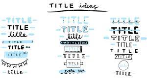
Planning Blog: Title Sequence
Contrast: The color of the font will be red so that it pops out on the black background. Example. Sound Director- Abigail Mitchell
* The sizing of the font for the title will be big and bold in the middle of the frame.
Spacing: Leading - Two lines of space above.
Tracking - Double spaced between the words.
Working Title: My working title for my film will be "The Night That Never Seemed To End’’.
* It will be a bold face font.
- Titles will be brought onto screen be a wave of blood washing over the black backdrop. The titles will disappear from the screen by dripping as if they were made from blood
- The title will disappear on the screen after 4 or 5 seconds. (Some will be on screen for 2 to 3 seconds.)
-All of the titles will go through the same process the only thing that will be altered is that the text will be bigger for the name of the movie.
-The names of people and actors who contributed to the film will be 2 times the size of the title they are associated with.


Comments
Post a Comment